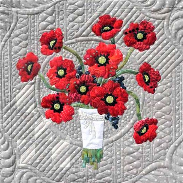
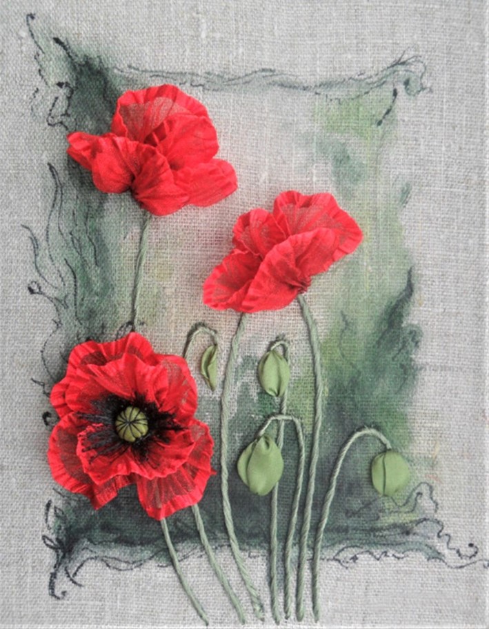
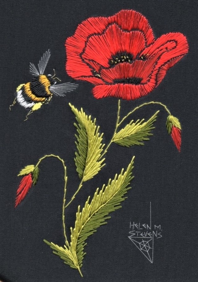
We’ve recently honored our veterans, and there were lots of poppy memes and photos going around the internet. Deb Geyer shared these from The Embroiderers’ Guild of Victoria:
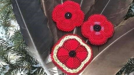
And I found this beaded example by Crystal Behn, A Dine and Carrier artist:
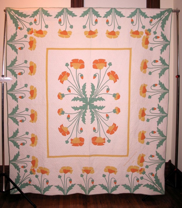
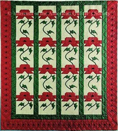
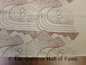
The first Embroiderers’ Guild shot looks like a quilt, so I’m somewhat on topic, but since this is the Hall of Fame blog, I’d be remiss if I didn’t show Marie Webster’s Poppy quilt (The above version was made using Quiltsmart printed interfacing). You’ve all seen it in red, and maybe pink; this is a rather rare colorway from the collection of Suzanne Hardebeck:
Photo: TQHF
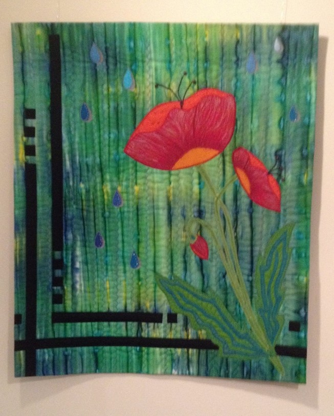
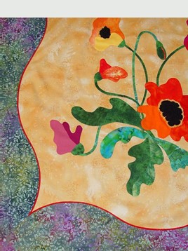
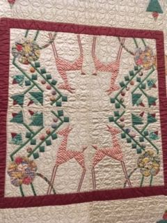
Marie’s design has inspired many interpretations. Here are two that have been exhibited at the Quilters’ Hall of Fame. The one on the left is “Love Returns” by Susie Goodman, and the one on the right is from Bonnie Browning’s lecture at Celebration 2013.
I could tell you that the takeaway here is “Poppies are popular”, but my real intention was to provide a segue to an idea that struck me when I was at the Milwaukee Museum of Art a little while ago: twinning art and quilts. I thought it would be fun to see how many paintings would put me in mind of a TQHF Honoree.
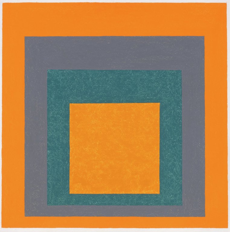
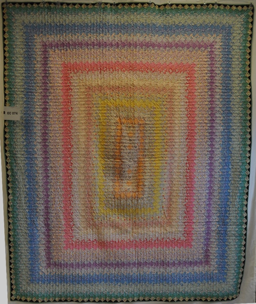
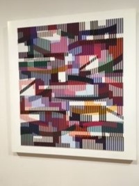
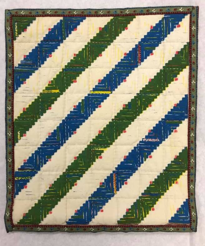
You may be familiar with the story of how TQHF Honoree Jonathan Holstein noted the connection between the work of artists like Josef Albers and Amish quilts, and went on to mount the seminal exhibit of quilts as art at the Whitney Museum fifty years ago. Here are two Albers compositions from Milwaukee, and you can readily see the similarity between them and a log cabin quilt.
Josef Albers. “Homage to the Square.”
The paintings also made me think of the progressive color bands in the American Tapestry (Trip Around the World) kits sold by Heritage Honoree, Mary McElwain.
Ranville, Caro. The American Tapestry. 1995. From Michigan State University Museum, Michigan Quilt Project. Published in The Quilt Index, https://quiltindex.org/view/?type=fullrec&kid=12-8-5855. Accessed: 11/15/21
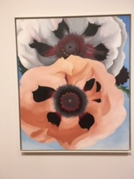
These were just the first connections I made. When I turned the corner, I came across another potential pairing, Georgia O’Keefe and Ruby McKim. What different interpretations! Where O’Keefe is organic in form, piecers have to be more angular. I personally find the painting to be almost sensual, but I also love the orderly arrangement of the quilt.
Left: Georgia O’Keefe. “Poppies.” Right: Ruby Short McKim pattern used by Thieme, Leureta Bea. “Oriental Poppy.” 1987. From National Quilt Museum, National Quilt Museum Collection. Published in The Quilt Index, https://quiltindex.org/view/ Accessed: 03/21/21
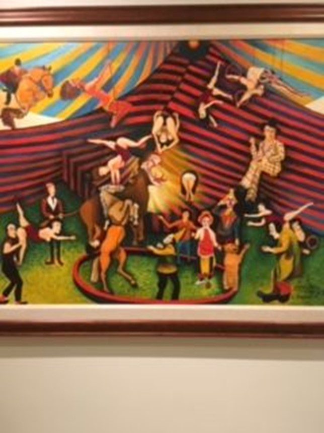
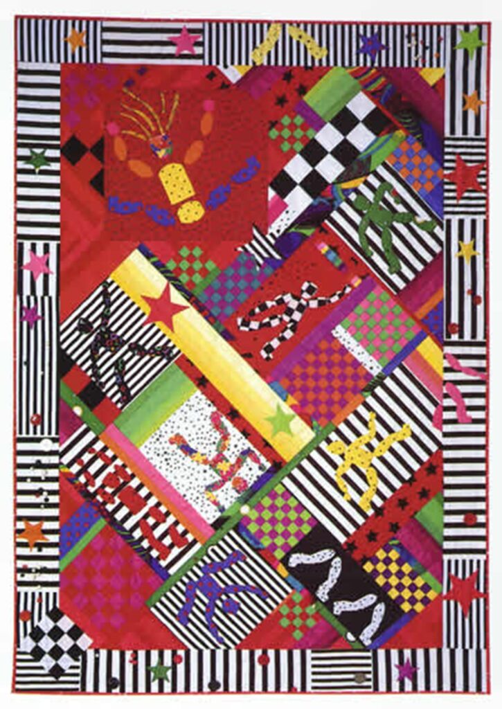
Next up was a fun artist who was totally unfamiliar to me: Cleveland Brown. I thought at the time that he and Honoree Yvonne Porcella would probably be kindred spirits. Their work shows a real sense of whimsy and action. Contrast these two treatments with Ruby McKim’s “take” on a circus. (I’ve put them one after another because I couldn’t figure out how to create a three-ring circus and still show detail.)
Cleveland Brown. “George Melly at the Circus.”Porcella, Yvonne. “Keep Both Feet on the Floor.” Photo: The Alliance for American Quilts.Ruby Short McKim. “Roly Poly Circus.” Photo from McKim Studios website.
And finally, another Porcella/ painter visual connection can be made with Yvonne’s first quilt, “Takoage”, and an intriguing 3-dimensional piece by Israeli artist Yaakov Agam, “Union II”. The painting is done in such a way that it changes colorway as you move in front of it. First the quilt, and then a left-center-right view of the painting.
Yvonne Porcella. “Tacoage.” Renwick Gallery of the National Museum of American Art, Smithsonian Institution. Yaakov Agam. “Union II”
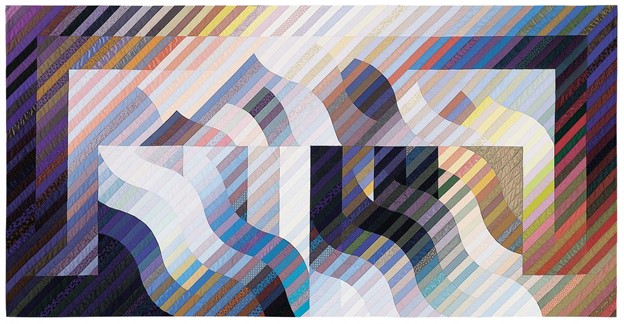
The painting also makes me think of Honoree Michael James’ early work. Here’s one of his quilts in the same colorway as the right view of Agam’s work.
Michael James. “Aletsch.” 1990. National Quilt Museum.
If I count an O’Keefe/ Webster poppy match, I’ve linked six Honorees with paintings (some with multiple connections): Marie Webster, Jonathan Holstein, Mary McElwain, Ruby McKim, Yvonne Porcella and Michael James. I’ll bet you can think of more. I invite you to try to try this fun exercise the next time you visit an art gallery or museum, and let me know what you find.
Your quilting friend,
Anna
If You Love to Look at Old Quilts, Thank Sally Garoutte
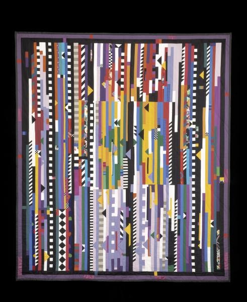
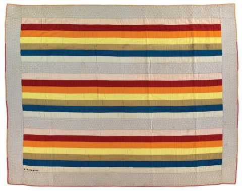
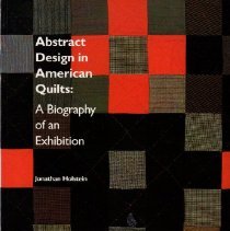
Before I get to Sally Garoutte, I have a follow-up to do. I promised to keep you posted on the International Quilt Museum’s retrospective of the 1971 Whitney Museum “Abstract Design in American Quilts” show. You’ll remember that the original show was mounted by Hall of Fame Honorees Jonathan Holstein and Gail van der Hoof, and at the time it rocked the art world by showing quilts as modern art. We’ve come a long way since then, but it’s always good to go back to the beginning. Here’s an iconic example from the original exhibit.
Rainbow Stripes Inscribed E. S. REITZ. Probably made in Pennsylvania, 1890-1910 IQM 2003.003.0041
Over the next several months, IQM will have four exhibits, each exploring a different aspect of the show: Abstract Design in American Quilts at 50, Raising the Profile, New York Nexus, and Journey to Japan. There’s a link below to the current exhibits on the IQM site; scroll down and select any of the four exhibits, and that will take you to a page where you can link to descriptions of each quilt in the exhibit, photos of the quilts on display, and even a 3-D tour of the exhibit in the IQM. There’s so much to see from the comfort of your couch, and so much to think about. Or, if you’re lucky, maybe you can catch one of the exhibits in person. Either way, be sure to mentally thank Jonathan Holstein and Gail van der Hoof for their foresight; Happy 50th Anniversary, “Abstract Design”!
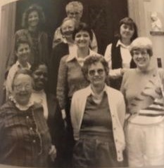
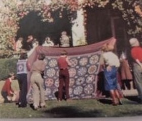
And the Whitney exhibit also provides the tie-in to this week’s Honoree, Sally Garoutte. You can read her full bio at the link below, but I’ll focus on her quilt story (and a bonus). While the “Abstract Design” exhibit was up on the East Coast, Sally was in California turning her studies in silk screening, color and textiles into a special interest in quilts. With fellow-Honoree Joyce Gross, Sally founded the Mill Valley Quilt Authority, (one of the early groups to promote quilting and the preservation of quilts). Sally and Joyce collaborated over many years, publishing Quilters’ Journal and founding the American Quilt Study Group. On the left is a photo from 1986 AQSG Seminar, with Sally front and center; she’s flanked by other notables who look a little different today. You may not recognize Barbara Brackman and Julie Silber, but Bets Ramsey is ageless. The photo on the right shows quilt documentation at the first AQSG Seminar in 1980; I won’t attempt to identify people from behind, but do you know what the quilt block is? But note the woman wearing a vest with a similar quilt block vest—fashions change, but quilt study carries on.
Both photos courtesy of AQSG for The Quilters Hall of Fame42 Masters Who Have Shaped Our Art Left photo Front row: Lucy Hilty, Sally, Virginia Gunn Middle row: Julie Silber, Cuesta Benberry, Flavin Glover, Barbara Brackman Back row: Sandy Metzler, Bets Ramsey, Dorothy Cozart
Sally was the editor of Uncoverings, AQSG’s annual publication of members’ research papers, from its founding through 1986, and co-editor in 1987. She herself contributed articles about Hawaiian textiles, Marseilles quilts, and an 1846 California quilting party. The list of other writers during her editorship includes many Hall of Fame Honorees: Barbara Brackman, Merikay Waldvogel, Virginia Gunn, Joyce Gross, Cuesta Benberry, Bets Ramsey, and even Florence Peto. You might also recognize Judy Mathieson of Mariner’s Compass fame and Joe Cunningham who, pre-pandemic, was teaching his improvisational style to guilds around the country.
But Sally didn’t take all comers. Even articles by famous persons had to be historically accurate and measure up to Sally’s standards for research. Here’s her thoughts on quilt history:
In an effort to illuminate the history of quilts in America, some early writers unfortunately did just the opposite. Using the writing style of 50 years ago, most historians did not document their sources, and simply stated their theories and surmises as though they were fact…. Folklore, however, is not history. Although we need the lore to understand what people thought and how they felt about things, we need history too. We need to know what happened and what people did, and we need to document it dependably.
“Early Colonial Quilts in a Bedding Context,”.Uncoverings; 1980.
In one of her early articles, Sally explains scholarly research:
Simply put, a scholarly paper is the account of research that has been done by its author. Its distinguishing feature is that it is verifiable.It states where and how its information was found, so that any other person can go and look at the same information. An article or paper that does not state clearly where its facts came from is not scholarly. It is a story asking to be taken on faith. It is not verifiable. The reader can only hope that the author has searched factual material before writing her conclusions, as there is no way to check it.
Quilter’s Journal; Spring 1981; Vol. 4, No. 1
Sally, for all her interest in quilt history, wasn’t a quilter, but there’s still a little to show. This quilt, which appeared on the cover of the 1978 issue of the journal Textile Chemist and Colorist, is the only quilt Sally made.
Courtesy of Kate Garoutte for The Quilters Hall of Fame42 Masters Who Have Shaped Our Art
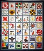
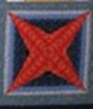
She also contributed a block to the Cuesta Benberry Friendship Quilt, but I don’t know if she made it or collected it; it looks pieced, but it also could be a print. Here’s the whole quilt with Sally’s block in the lower right corner and a larger version of that block—it’s called “Star on a String”.
“Cuesta Benberry’s Friendship Quilt”. 1979 Garoutte block “Star on a String” Assembled by Betty Hagerman and Helen Ericson. Collection of Michigan State University Museum acc.#2008:119.11
Garoutte block “Star on a String.”
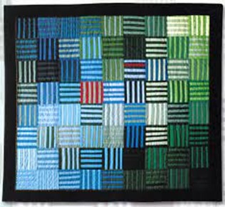
The reason I suggest that Sally’s block could be a print is because silk screening was her medium. So now, here’s the bonus: I’m going to get to show you some things I just helped to catalog for the Quilters Hall of Fame collection. Here are two little quilts, the tops of which were made by Sally; we know that the log cabin was quilted by someone else, but don’t know about the other. There are links below if you want to read the full descriptions.
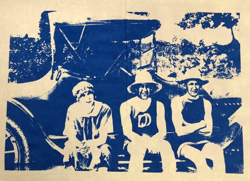
Also in our collection is a group of screen prints, eight of them showing autos, and six with people in or on the water. These were part of a research project, “Treasures From a Shoebox”, that Sally did when she was at Goddard College in 1974. The original images were family photograph negatives that she found in the attic. Here’s one of them, and there’s a link for the rest. With all but one of the images Sally experimented with different colors of ink or with different background fabrics, so be sure to see them all to get a flavor of her artistic process.
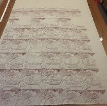
We also have a large undated piece made by Sally and donated by Hall of Fame Founder, Hazel Carter. We don’t know if this was also a college project or a later work, so if anyone has more information, please let us know. This is a large piece, 47” x 66”, and unlike the “Treasures”, it is printed on a heavy fabric, almost like a woven coverlet. I can’t imagine what it would be used for, so I’m going to say it’s “art for art’s sake” (ars gratia artis—you’ve seen that quote above the lion in old movie reels).
Well, that’s Sally Garoutte. I wouldn’t be writing today if I hadn’t attended an AQSG Seminar in Lincoln, Nebraska in 2012 and gotten hooked on quilt history. And I’m looking forward to this year’s Seminar in the Shenandoah Valley, where I’m sure to see many wonderful old Virginia quilts and many wonderful old friends and colleagues. I have a lot to thank Sally Garoutte for, and I’m glad to have had this chance to get to know her better. I hope you feel the same way.
Jonathan Holstein: Quilts From the Bed to the Wall
My first blog entry was about Gail van der Hoof, who is known as one of the forces behind the ground-breaking quilt exhibit at the Whitney Museum in 1971. Now it’s time to tell you about the other half of that partnership, Jonathan Holstein. As a refresher, the exhibit they mounted, Abstract Design in American Quilts, at New York City’s Whitney Museum of American Art, is credited with taking quilts from the bed to the wall as a form of art to be appreciated not for warmth but for artistic qualities such as form, color and design. You can read a fleshed-out version of the Holstein/van der Hoof collecting and exhibit story, along with more info about his life at the bio link below.
Today, I want to go to a museum—at least in my mind—and think about art. Having repeated the conventional view of the Whitney exhibit, I wonder how accurate it is. Haven’t there always been quilters who saw their work as art? Remember last week when we talked about Rose Kretsinger’s designs? Surely, she was applying the principles of form and design that she learned at the Art Institute of Chicago. As did Bertha Stenge, another Hall of Fame Honoree who studied at the San Francisco School of Art. Take a look at the center of one of Stenge’s quilts, Gazelle, and see if you don’t recognize the Art Deco elements. Or The Spectrum, which was another quilt artist’s entry to the 1933 Sears contest at the Chicago Worlds Fair, which certainly shows color, form and line.
Stenge, Bertha. Gazelle. Circa 1933 International Quilt Museum Author’s photo
Matthews, Edith Morrow. The Spectrum. 1933. From Waldvogel Archival Collection, Sears Quilt Contest 1933 Chicago World’s Fair. Published in The Quilt Index, http://www.quiltindex.org/fulldisplay.php?kid=5B-9D-C. Accessed: 08/30/2020
I would say that the artistic element could always be found in at least some quilts, but it took a Jonathan Holstein to make the art world –and not just the quilting world–aware of it. So, what was special about the Whitney exhibit that makes us say (properly) that it was the beginning of quilts being seen as art? For a scholarly analysis, I read Karin Elizabeth Peterson, cited below. Peterson makes the interesting point that it’s the whole museum experience that transformed quilts into art. First, it’s the venue in which the quilts are displayed. She says, “Museums can be understood as places where quasi-sacred rituals take place. Rituals that define legitimate objects, legitimate artists and legitimate viewers…. Museum space facilitates an art-for-art’s sake experience by employing a series of architectural and display cues: isolated rooms, small labels, white walls, spotlighted pedestals, space to stand back from works and grasp their effect…. The museum, which is structured to appear neutral, objective and disinterested, privileges a special way of viewing objects within its walls.”
The other aspect Peterson notes is Holstein’s discourse about the quilts. For example, when he “pitched” the exhibit to the Whitney staff, he presented slides of the works, just as he would have done with his photographs. In titling the exhibit, he carefully chose wording that would make a connection to the world of abstract art. And when he wrote the catalog and promotional materials, he was careful to write about quilts as he would any other work of art: not focusing on workmanship, but using phrases like “sensibilities and visual skills of the artist”, “laying on colors and textures”, “a traditional American approach to design, vigorous, simple, reductive”. (1971 Exhibit catalog)
So, here’s the takeaway: Art is seen at the art museum, not the local school gym. And if you’re going to call it art, you have to use art jargon. Sounds simplistic and a bit cynical, but that’s just what Jonathan Holstein did, and he was successful with it. The quilt world hasn’t been the same since.
There were other “art” exhibits after the Whitney: in 1972, American Pieced Quilts, opened at the Renwick Gallery of the National Collection of Fine Arts in Washington, D.C. (this exhibit traveled to twenty-one American museums and two English venues under the auspices of the Smithsonian Institution Traveling Exhibition Service (SITES); in 1975, there was an exhibition for the Shiseido Corporation in Tokyo and the American Cultural Center Kyoto, the first show of American quilts in Japan; the following year, another exhibit was mounted at the Kyoto Museum of Modern Art.; and in 1980, Amish Quilts, from Pennsylvania and the Midwest, was seen in ten museums in the United States.
Holstein is also the author or co-author of several books, all of which are in the Quilters Hall of Fame collection and available for purchase on the open market.
In 2003, the entire Holstein/ van der Hoof collection of quilts and ephemera was donated to the International Quilt Museum in Nebraska. It was then valued at around $2.2 million—not bad for collectors who had initially set themselves a $36.00 limit when buying a quilt. There’s a link below to a charming video of Holstein reminiscing about the first Amish quilt he purchased—for $5.75! There’s also a link that will give you access to all of the quilts now in the IQM, but I’ve put in a few here as a teaser.
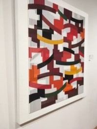
There are a number of crazy quilts in the Collection, and this goes in the same era. Holstein probably chose this for its off-center focus.
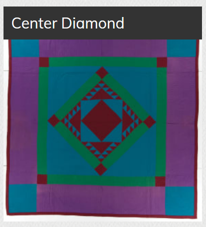
This one appealed to me from the hundred or so Amish quilts in Collection because of the almost vibrating green next to purple and the triangles surrounding the center diamond.
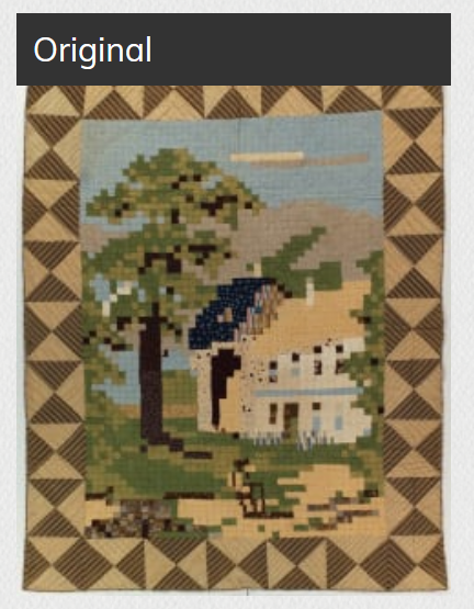
Not art at all! What’s it doing in the Collection? Pictorial images don’t fit with abstract art.
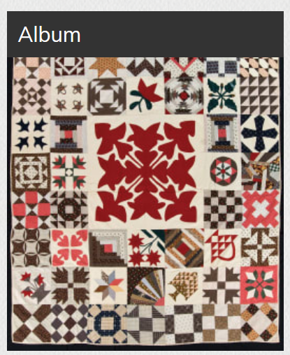
And what could have made Holstein choose this one? I like the limited palette, but samplers aren’t typical of the Collection.
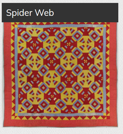
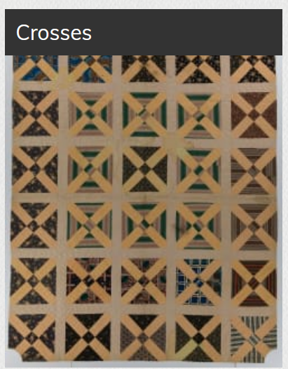
These two are graphic, and I think I can recognize what must have drawn Holstein to them.
OK. You’ve seen my choices. When you have time, take yourself to the International Quilt Museum and pick out your own favorites from the Collection. Let me know what you find, and what strikes your fancy; leave a comment at the end of the blog. And if you have lots of time, you might also enjoy hearing Jonathan Holstein walk you through an exhibit that was shown at the IQM called “Quilts in Common”. (link below) There are a few quilts from his Collection, but the exhibit format was comparing pairs of related quilts. Holstein’s artist’s eye, which first got quilts on the Whitney walls, is well worth looking through as he talks about these quilts. And he shares some stories and photos which are a funky and fun view of his early buying days.
After I’ve written something like this, I find myself thinking “What if??” and recognizing how much I don’t know. What if I had studied design or trained to be a museum curator? What if I had chosen, as Jonathan Holstein did, to center my professional life around quilts? Well, I didn’t, so I can just be grateful that Holstein was on the scene when he was, and that he continues to be active in the quilt/art world today.
Karin Elizabeth Peterson, “Discourse and Display: The Modern Eye, Entrepreneurship, and the Cultural Transformation of the Patchwork Quilt,” Sociological Perspectives. Vol 46, Number 4, 2003