We’ve recently honored our veterans, and there were lots of poppy memes and photos going around the internet. Deb Geyer shared these from The Embroiderers’ Guild of Victoria:
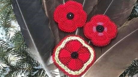
And I found this beaded example by Crystal Behn, A Dine and Carrier artist:
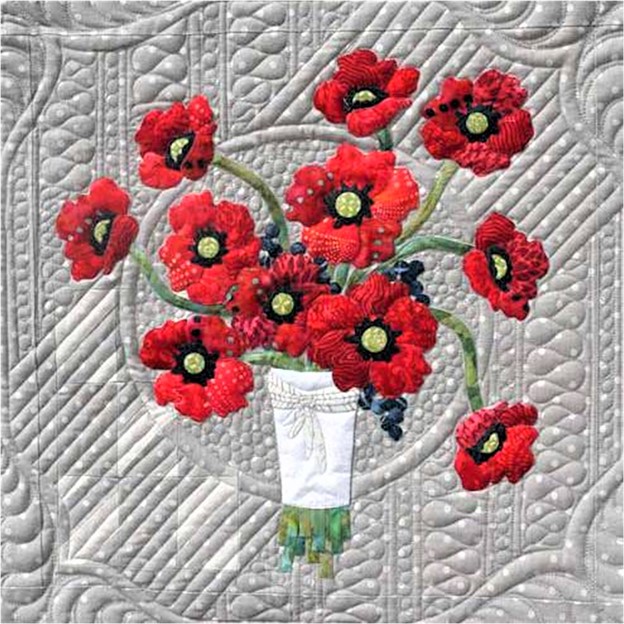
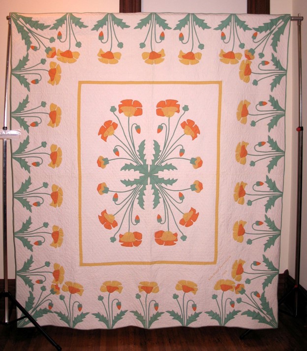
The first Embroiderers’ Guild shot looks like a quilt, so I’m somewhat on topic, but since this is the Hall of Fame blog, I’d be remiss if I didn’t show Marie Webster’s Poppy quilt (The above version was made using Quiltsmart printed interfacing). You’ve all seen it in red, and maybe pink; this is a rather rare colorway from the collection of Suzanne Hardebeck:
Photo: TQHF
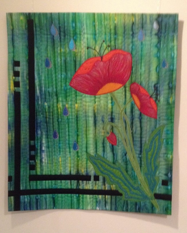
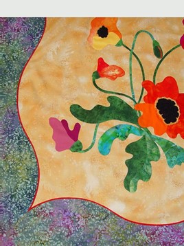
Marie’s design has inspired many interpretations. Here are two that have been exhibited at the Quilters’ Hall of Fame. The one on the left is “Love Returns” by Susie Goodman, and the one on the right is from Bonnie Browning’s lecture at Celebration 2013.
I could tell you that the takeaway here is “Poppies are popular”, but my real intention was to provide a segue to an idea that struck me when I was at the Milwaukee Museum of Art a little while ago: twinning art and quilts. I thought it would be fun to see how many paintings would put me in mind of a TQHF Honoree.
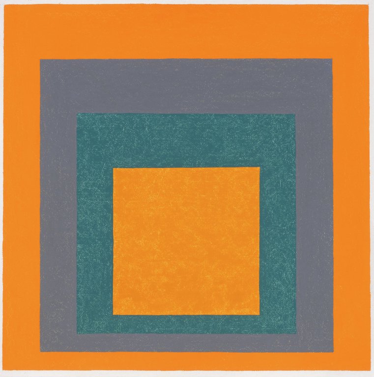
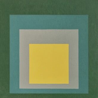
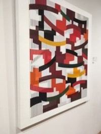
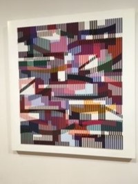
You may be familiar with the story of how TQHF Honoree Jonathan Holstein noted the connection between the work of artists like Josef Albers and Amish quilts, and went on to mount the seminal exhibit of quilts as art at the Whitney Museum fifty years ago. Here are two Albers compositions from Milwaukee, and you can readily see the similarity between them and a log cabin quilt.
Josef Albers. “Homage to the Square.”
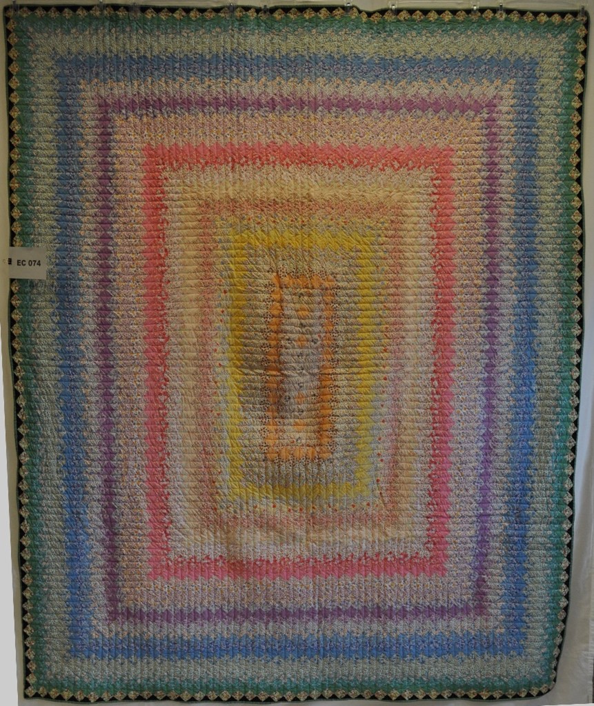
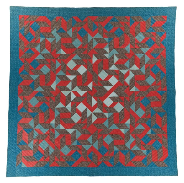
The paintings also made me think of the progressive color bands in the American Tapestry (Trip Around the World) kits sold by Heritage Honoree, Mary McElwain.
Ranville, Caro. The American Tapestry. 1995. From Michigan State University Museum, Michigan Quilt Project. Published in The Quilt Index, https://quiltindex.org/view/?type=fullrec&kid=12-8-5855. Accessed: 11/15/21
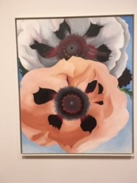
These were just the first connections I made. When I turned the corner, I came across another potential pairing, Georgia O’Keefe and Ruby McKim. What different interpretations! Where O’Keefe is organic in form, piecers have to be more angular. I personally find the painting to be almost sensual, but I also love the orderly arrangement of the quilt.
Left: Georgia O’Keefe. “Poppies.” Right: Ruby Short McKim pattern used by Thieme, Leureta Bea. “Oriental Poppy.” 1987. From National Quilt Museum, National Quilt Museum Collection. Published in The Quilt Index, https://quiltindex.org/view/ Accessed: 03/21/21
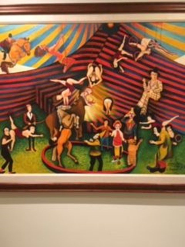
Next up was a fun artist who was totally unfamiliar to me: Cleveland Brown. I thought at the time that he and Honoree Yvonne Porcella would probably be kindred spirits. Their work shows a real sense of whimsy and action. Contrast these two treatments with Ruby McKim’s “take” on a circus. (I’ve put them one after another because I couldn’t figure out how to create a three-ring circus and still show detail.)
Cleveland Brown. “George Melly at the Circus.”Porcella, Yvonne. “Keep Both Feet on the Floor.” Photo: The Alliance for American Quilts.Ruby Short McKim. “Roly Poly Circus.” Photo from McKim Studios website.
And finally, another Porcella/ painter visual connection can be made with Yvonne’s first quilt, “Takoage”, and an intriguing 3-dimensional piece by Israeli artist Yaakov Agam, “Union II”. The painting is done in such a way that it changes colorway as you move in front of it. First the quilt, and then a left-center-right view of the painting.
Yvonne Porcella. “Tacoage.” Renwick Gallery of the National Museum of American Art, Smithsonian Institution. Yaakov Agam. “Union II”
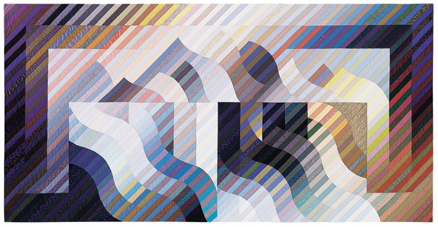
The painting also makes me think of Honoree Michael James’ early work. Here’s one of his quilts in the same colorway as the right view of Agam’s work.
Michael James. “Aletsch.” 1990. National Quilt Museum.
If I count an O’Keefe/ Webster poppy match, I’ve linked six Honorees with paintings (some with multiple connections): Marie Webster, Jonathan Holstein, Mary McElwain, Ruby McKim, Yvonne Porcella and Michael James. I’ll bet you can think of more. I invite you to try to try this fun exercise the next time you visit an art gallery or museum, and let me know what you find.
Your quilting friend,
Anna
Michael James: Rhythm and Color
One good thing about writing this blog is that I learn a lot of new things about some pretty extraordinary people. An even better thing is that I learn when I’ve been wrong about one of them. Case in point: Michael James. There’s bio information about him in the link below, but if you’re like I was, you may be saying, “I know Michael James; he’s the guy that does those striped art quilts.” Yes, but read on.
With his formal art background, Michael James began quilting for art’s sake. He came into quilting in the era of the Whitney Abstract Design show, and his early work is replete with form and color. Here’s an example with complementary hues, value changes and more y-seams than I would care to make.
Elaborated Tangram. 1976. International Quilt Museum.
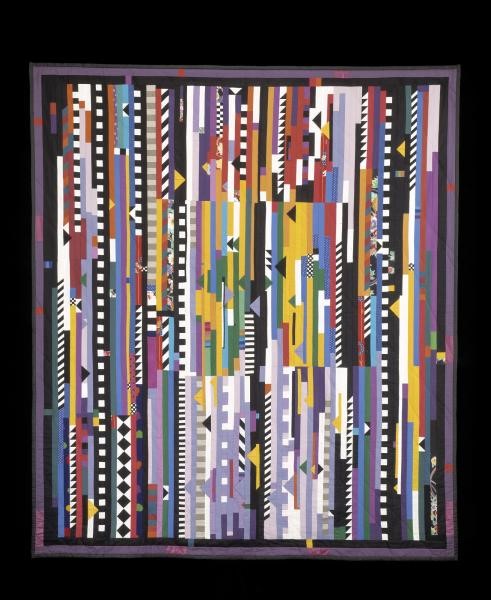
Shortly after that quilt, the stripes took over. James made his own yardage from strips of cotton and silk sewn together in gradations of color or value, and he experimented with this medium for nearly fifteen years. You’re going to recognize the signature Michael James style in the next three quilts.
Rhythm/Color: Spanish Dance. 1985. Newark Museum.
This is one of a series named after dance styles, and there’s plenty of movement in the quilt; other quilts in the series include Morris Men and Bacchanal. You can appreciate the color work here, and still recognize the Drunkard’s Path block. That changes in the next quilt.
Quilt #150: Rehoboth Meander. 1993. Smithsonian American Art Museum. Gift of the James Renwick Alliance.
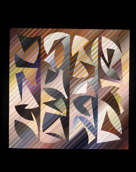
The stripes are still there, but what happened to the block? The comfortable curve of the Drunkard’s Path has gotten jagged. Also, the grid is completely overridden, and I wouldn’t want to guess how this piece was put together. I can identify vertical panels, but no horizontal blocks. James consciously tried to move away from the traditional quilt block construction method; he felt that it was becoming “too predictable.”
The last of my stripe examples shows James as a painter. He’s trying to capture a scene and use his art to evoke an experience.
Aletsch. 1990. National Quilt Museum.
James explains his inspiration:
Aletsch is part of a series of quilts that represent my efforts to synthesize sensory responses to a particular space: the vast mountainous basin in the Swiss Alps that encloses the Aletsch Glacier, the largest in Europe. In the summer of 1988 I spent several days hiking along its perimeter, which extends many kilometers down from the Jungfrau firn. What impressed me most was the very audible sound of millions of gallons of water rushing unseen beneath the perfectly still expanse of glacier. It seemed incongruous: the unrelenting movement of so much water and the stone rigidity of so much ice. Combined with the brilliance of the light and the clarity of the air, that incongruity made for a very memorable scenario.
But let’s go back to a simple version of the stripes because it will set the stage for telling you how I was wrong about Michael James:
Interweave. 1982. International Quilt Museum.
Interweave looks like something you or I could make. Maybe not with all those colors (some of his quilts have as many as 150 different colors), and probably not with such mastery of value and luminosity. But I could construct this quilt, and so could a beginner. And that’s just the thing: Michael James began as a beginner. And he did the hard work of learning to quilt well because to him, “good craftsmanship is the foundation on which the art of the quilt rests…. as much depends on craft as on vision.”
So now we come to the part I was wrong about. I think of Michael James as only an art quilter, but there’s a backstory. In addition to formal art training, he has a history with traditional quilting. And I’m not just talking about his family background in the textile industry. (His great-grandparents emigrated from rural Quebec and from Preston, Lancashire to work in the textile mills of south-eastern Massachusetts, where he grew up in the shadow of the local textile mill himself.)
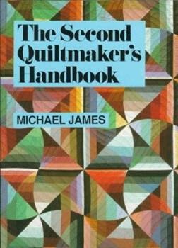
He wrote (in addition to other things) two how-to books. I own both, but had never really looked at them because I’ve given up on the idea that I will ever be an art quilter. I made the mistake of thinking these books were just about making art quilts. When I pulled my copies off the shelf to start writing, I got a big surprise. They aren’t about art quilts; they’re about quilting.
These are-IMHO- the best basic instructional books available. In the first handbook, the descriptions of basic techniques are scrupulously written and the photos show it all broken into each individual step. I haven’t come across a better explanation of the quilting stitch. The second handbook brings that same full explanation to the more artistic components including design and use of color. If I still wanted to make a graphic-style art quilt, I could follow these steps. These books can be found on the used book sites and for under $3.00 on Amazon—well worth the price.
Well, the books were just the beginning of my finding that I didn’t know Michael James like I thought I did. But I’ve learned.
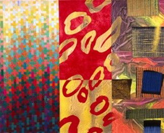
I now know that for the last twenty or so years, he’s been making digital quilts (quilts constructed with fabric on which he has printed and tinkered with images—his art major was painting and printmaking). I’ll give you just a small taste of those, and you can find more on the links below (his website, International Quilt Museum collections search and IQM exhibit), and Pinterest is full of images of his digital work.
Terminus of One Path. 2008. Wikipedia photo.
Smoke Signals. 2001. Indianapolis Museum of Art at Newfields.
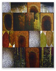
Daybook. 2006. International Quilt Museum.
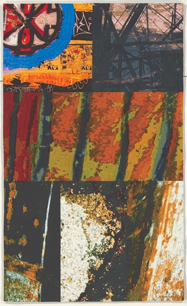
The Idea of Matter. Photo: (NE) Journal Star 12/11/2010
What interests me about these quilts, in addition to their beauty or creativity, is James’ “take” on the process. He places digital printing squarely in line with the historical evolution of other quilt-related processes (think of the development of roller printing) and is surprised that the general quilt world doesn’t see the connection. He doesn’t mind cutting up a lovely, printed image (which he may have spent hours manipulating) any more than I would hesitate to cut a commercial fabric. And his foundation in traditional piecing techniques allows the most difficult inserts.
While poking around for material, I came across a comment from someone who had purchased one of James’ books. She mused (queried/complained) that a man who makes quilts can be called an artist but a woman is just a quilter. Never mind that the comment is limited and petty; I now know that Michael James is an artist who has worked all of his adult life with his chosen medium, and is still a quilter at heart. And that’s why he’s in The Quilters Hall of Fame.